Mapping Climate Communication – slideshow for #COCE2015 and #UE2015

Mapping-Climate-Communication.-TIMELINE-15-OCT2014-web-sm

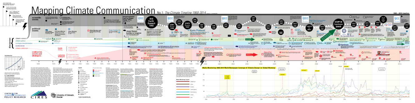
The Mapping Climate Communication project offers an overview of how climate change is communicated in the public realm by visualizing actors, events, strategies, media coverage and discourses influencing public opinion. Two large-scale maps and one Poster Summary Report were published on-line October 2014. The project uses two visualization methods: a timeline and a network visualization. The Climate Timeline (CT) visualizes the historical processes and events that have lead to the growth of various ways of communicating climate change. The Network of Actors (NoA) illustrates relationships between institutions, organizations and individuals participating in climate communication in Canada, United States and the United Kingdom. Together these two visualizations contextualize events and actors within five discourses: climate science, climate justice, ecological modernization, neoliberalism and climate contrarianism. Since communication happens at the level of rhetoric as well as the level of action, discourses in this project include explicit messages and also messages that are implicit within political, corporate and organizational activities and policy. This approach reveals tensions and contradictions in climate communication.

Mapping Climate Communication: No.1 Climate Timeline and No.2 Network of Actors

The Mapping Climate Communication Project illustrates key events, participants and strategies in climate communication.

1) Climate Timeline visualizes the historical processes and events that have lead to various ways of communicating climate change. Key scientific, political and cultural events are plotted on a timeline that contextualizes this information within five climate discourses. These reveal very different ideological, political and scientific assumptions on climate change. A clearer version of the timeline is available here. Download a PDF here and a JPEG here.

Climate Timeline

Climate Timeline

2) Network of Actors displays relationships between 237 individuals, organizations and institutions participating in climate communication in Canada, United States and the United Kingdom. A clearer version of this graphic is available here.

MAPPING-Climate-Communication-Network-of-Actors-2014-web

Details about this project can be found in the Mapping Climate Communication: PosterSummary Report. This report can be downloaded here.

The maps reveal how specific details in climate communication are contextualized within complex debates. For example:

  1. How does a climate march impact the volume of media coverage of climate change?
  2. How does the work of the climate denial industry potentially impact climate policy?
  3. Do popular movies and books on climate result in activity in the climate movement?
  4. What are the relationships between organizations active in climate communication?

By illustrating key events and actors over time and within five discourses this work makes links between disparate factors and reveals dynamics that contribute to public understanding of climate change. The project also explores politicised issues in climate communication by using a discourse approach to analyse the various strategies and ideologies held by those organizations, institutions and individuals participating in climate communication in the public realm. This report describes the impact of neoliberal dogma and modes of governance on climate communication as one of the central problems preventing a global response to climate change. Theorizing the impact of neoliberalism on climate change communication and policy is key to an understanding of why emissions continue to rise despite the significant work by the climate science community and the environmental movement over the past four decades.

Visualizing the Environment and the Politics of Representation

sea ice volume12:00 – 1:00 PM, 16 April 2014. Center for Science & Technology Policy Research Noontime SeminarSpring 2014 Series.

Institute of Behavioral Sciences, 155 B  (webcast live). Grandview Avenue. University of Colorado in Boulder.

This talk will introduce the many ways that images work to communicate environment issues. With the rise of data visualization, new mapping strategies, network visualizations and other types of information design, images are increasingly being mobilized to support environmental learning. Images can be powerful tools capable of supporting public understanding of the environment while also potentially influencing behavior and social norms. Images can work to make complex information accessible in ways that are especially well suited for environmental communication since they have the unique ability to reveal relationships, patterns, dynamics and causality in complex socio-ecological systems. On the other hand, within the politically and ideologically loaded terrain of environmental communication, images are also capable of concealing tensions, complexities and interests behind environment problems. Images are regularly used to reproduce the perspectives of powerful interests, often in ways that obscure environmental circumstances and the consequences of various types of industrial development and consumption patterns. Visual representation of the environment embodies political and philosophical assumptions about the capacity of the natural world to sustain continued abuse along with other associated notions of human-nature relations. This talk will examine how images are used to both reveal and conceal environmental circumstances with examples of particularly effective, politicized and/or disingenuous visualizations of the environment.


Review of DRS//CUMULUS Oslo 2013 – 2nd International Conference for Design Education Researchers

Designing Learning for Tomorrow: Design Education from Kindergarten to PhD
DRS//CUMULUS Oslo 2013 – 2nd International Conference for Design Education Researchers

IMG_2315

Oslo Opera House and skyline

I travelled to the DRS//CUMULUS Oslo 2013 – 2nd International Conference for Design Education Researchers with some trepidation. While I have high expectations of the content produced by the Design Research Society (DRS) and was already intrigued by some of the papers and keynotes, my concerns emerged from what I am witnessing in design education in the UK. I was travelling to Oslo supported by a crowd funding campaign rather than the institution where I had been working when I wrote my paper. As an advocate of sustainability literacy and an early career researcher witnessing (and feeling) the impact of the austerity agenda in higher education in the UK, I wondered if the conference would rise to the challenge of confronting the most serious issues in design education.

Continue reading

Re-Imaging the Commons as ‘The Green Economy’ – Posters, images and new resources

I am publishing two new posters associated with the paper Re-Imaging the Commons as ‘The Green Economy that will be presented at the International Environmental Communication Association’s 2013 conference Environmental Communication: Participation Revisited: openings and closures for deliberations on the commons in Uppsala, Sweden June 6th-9th 2013. The posters can images can be downloaded here (as low resolution jpegs) or higher resolution posters to print on the EcoLabs website.

GE---2-Final-sm

Above – Overview of problems associated with the UNEP’s ‘green economy’.


Continue reading

Flows of Money Into and Out of Low and Middle Income Countries

In wealthy countries such as the UK we like to think that rich nations help poorer nations with aid and other types of development funding. We have millennium goals to eradicate poverty, surely we are helping our Southern neighbours develop sustainably?

Money-flows-ecolabs

Activists from the Global South tell a very different story. This map illustrates this counter-narrative using data from World Bank depicting the hidden flows of capital into and out of low and middle-income countries. It exposes the disturbing fact that rich nations extract significantly more money from the low and middle-income nations than they give in aid. Continue reading

Visualising the Economic System – and Alternatives

Over the past six months I have been helping Occupy Design UK explore how design can be used to facilitate popular education on the structural causes of the recent economic crisis. During the London Design Festival we held an event at the V&A called ‘Exposing the 1% and De-branding the City’ where we examined information graphics and animations that illustrate the complexity of our economic system and exactly what went so wrong in the recent credit crisis. The following visualisations expose the dynamics and structural problems within the current economic system and propose what we can do to create a more resilient system for long-term prosperity, social justice and sustainability.

Crises of Capitalism. RSA Animate. Cognitive Media.

This animation features Marxist historian David Harvey’s analysis of the structural causes of the economic crisis and the role of crisis in the history of capitalism. Here animation studio Cognitive Media use the Monopoly metaphor that the Occupy Movement has also repeatedly used to describe the systemic dynamics of capitalism (another example can be found below). This video presents an overview of the contradictions of the capitalism system. While the Royal Society of Arts funded this animation, Harvey’s interpretation of the causes economic crisis remains marginal in mainstream economic discourse. The Occupy Movement has successfully created at least some discursive space in mainstream media for radical critiques such as this one.

Capitalism_as_pyramid

Capitalism is a Pyramid Scheme

CrimethInc. Workers’ Collective and Packard Jennings. Pdf back of poster.

Pyramid_of_capitalist_system

The poster included with the CrimethInc. Workers’ Collective book ‘Work’ is based on a classic illustration Continue reading